
Cropp branding
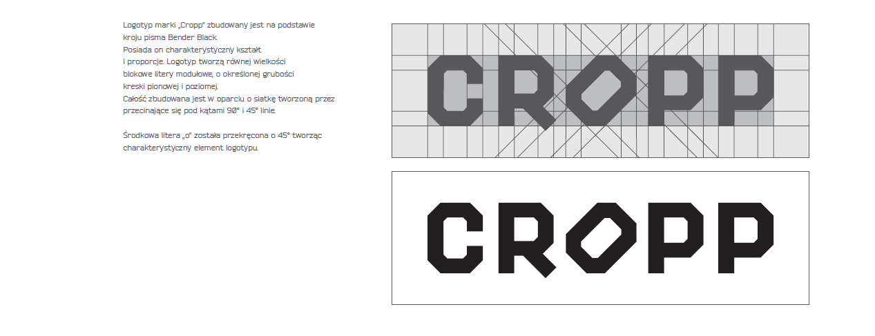
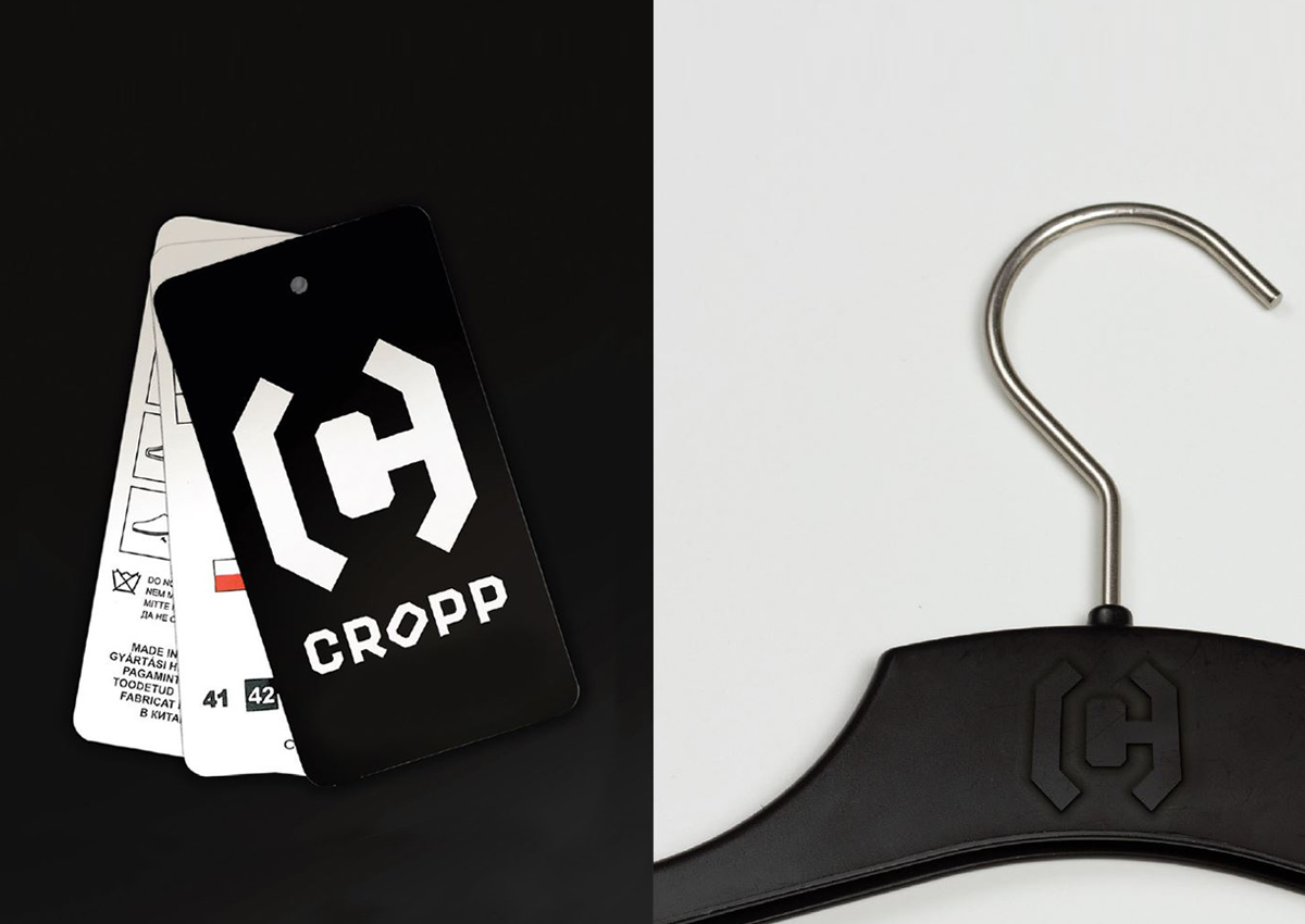
The Cropp brand logo is based on the Bender Black typeface. It features distinctive shapes and proportions. The logo consists of uniform, modular block letters with a consistent thickness of vertical and horizontal strokes. The entire design is constructed on a grid formed by intersecting lines at 90° and 45° angles. The central letter “o” has been rotated by 45°, creating a distinctive element of the logo. marki „Cropp” zbudowany jest na podstawie kroju pisma Bender Black. Posiada charakterystyczny kształt i proporcje. The Cropp brand logo is based on the Bender Black typeface. It features distinctive shapes and proportions. The logo consists of uniform, modular block letters with a consistent thickness of vertical and horizontal strokes. The entire design is constructed on a grid formed by intersecting lines at 90° and 45° angles. The central letter “o” has been rotated by 45°, creating a distinctive element of the logo. tworzą równej wielkości blokowe litery modułowe, o określonej grubości kreski pionowej i poziomej. Całość zbudowana jest w oparciu o siatkę tworzoną przez przecinające się pod kątami 90° i 45° linie. Środkowa litera „o” została przekręcona o 45°, tworząc charakterystyczny element logotypu.